Intaglio Prints
The process and appearance of Intaglio prints lend themselves to a strong sense of doom or grim. This effect is used to enhance the mood of the viewer and add a layer of discomfort when viewing.
One Last “Game Over”, 19.5”x 13”
2025
2025
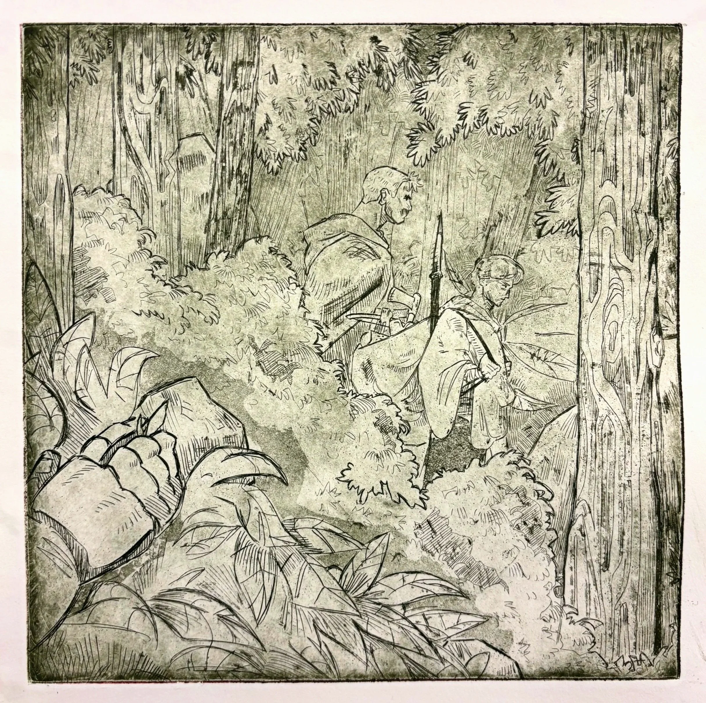
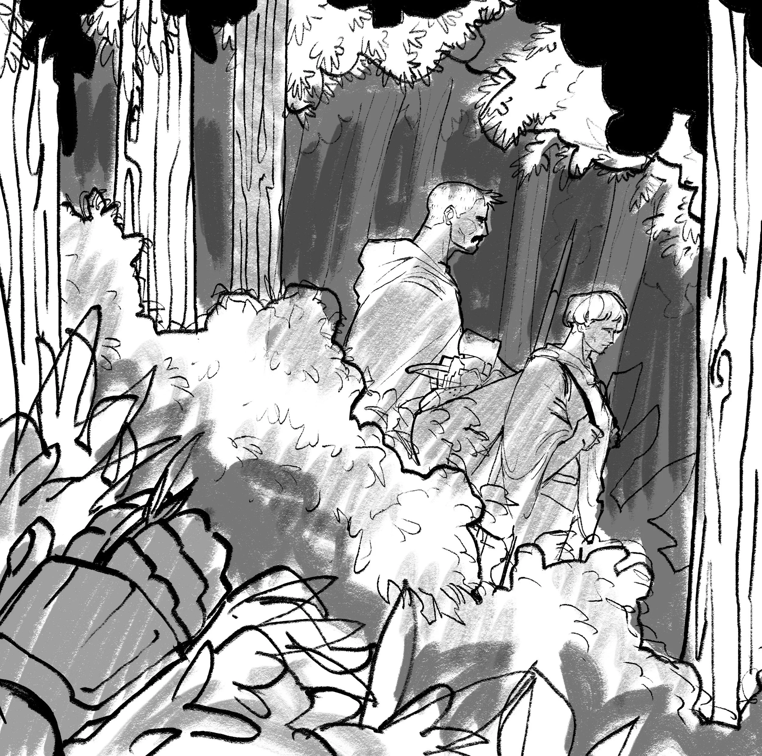
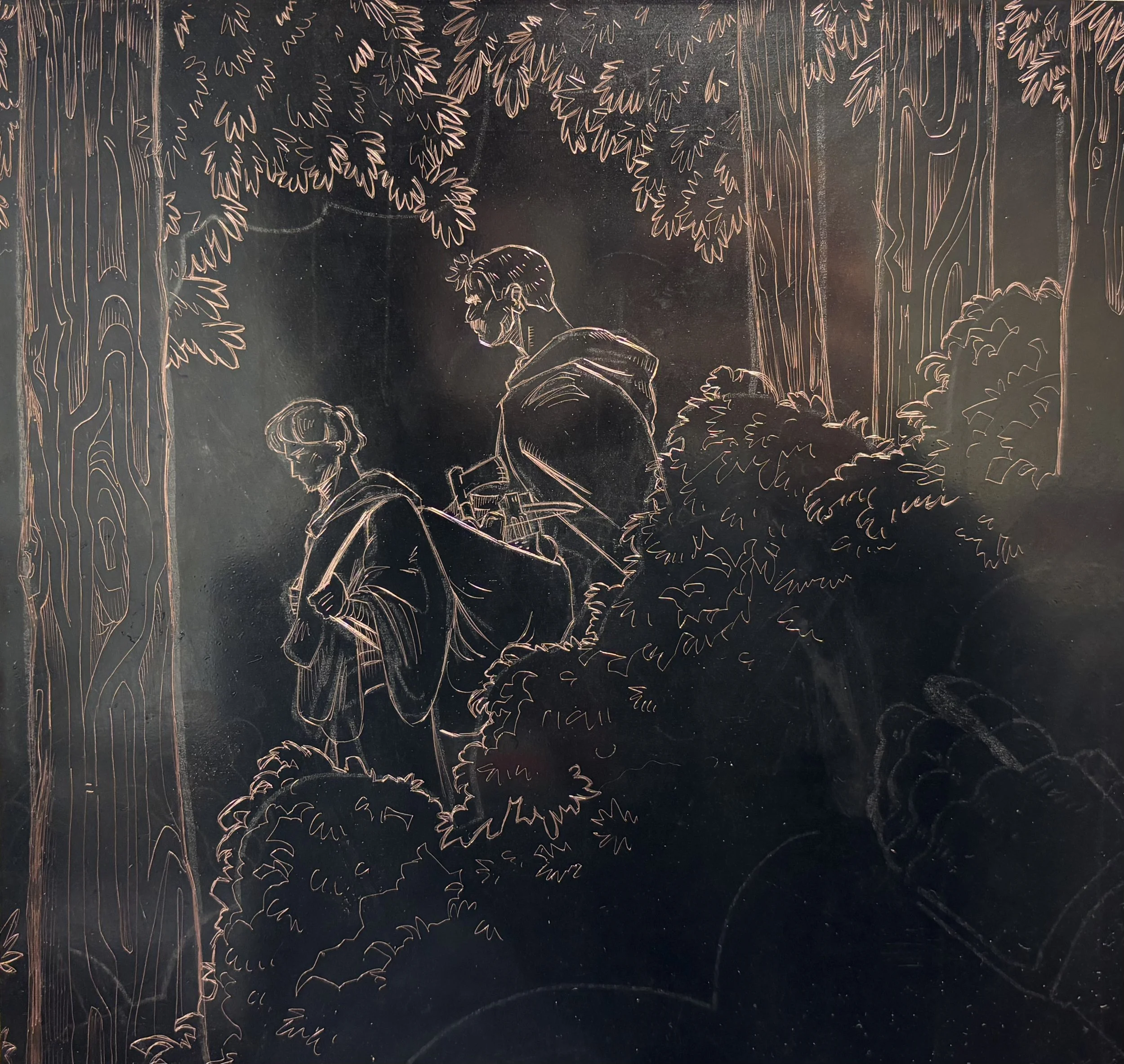
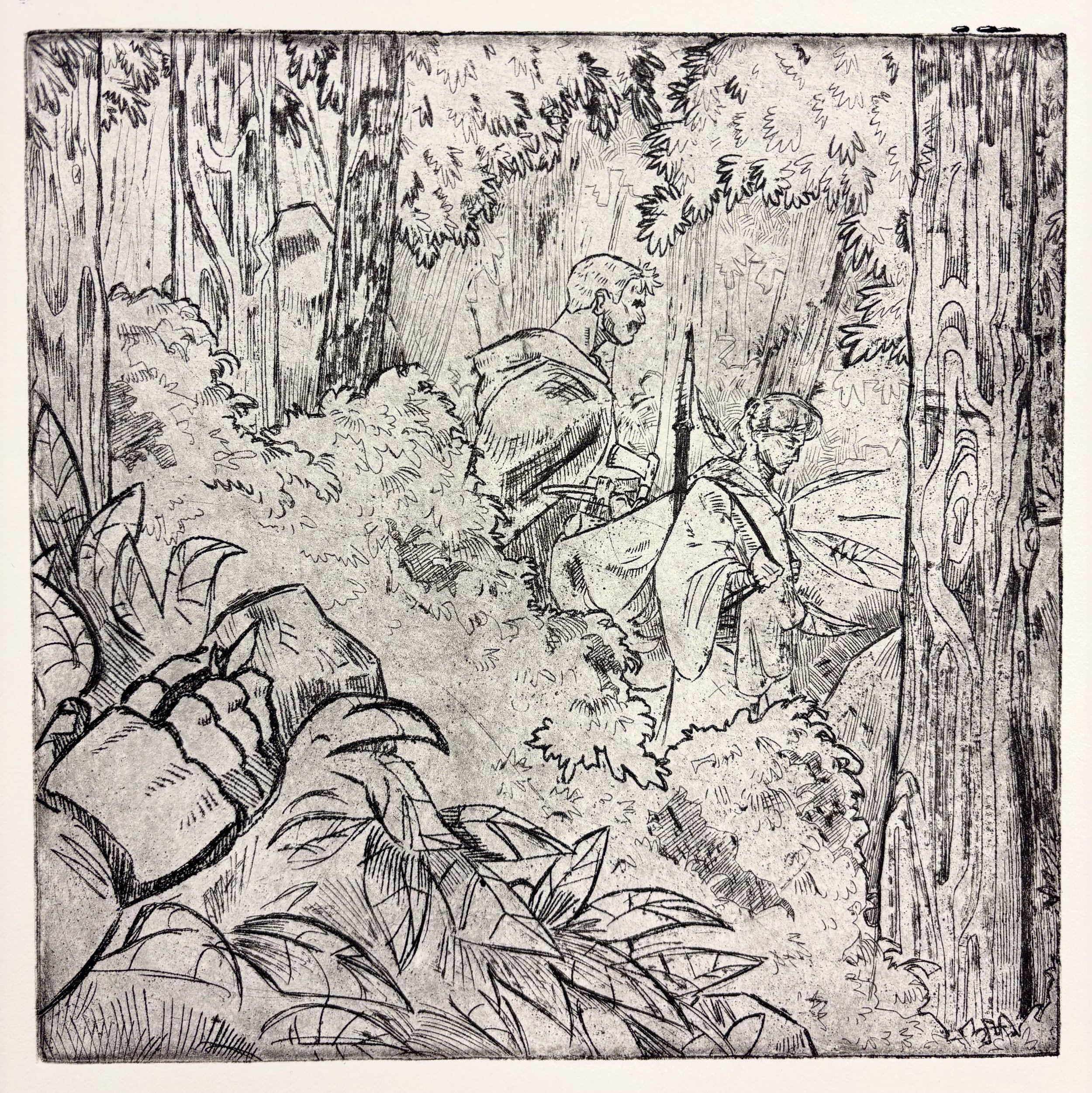
Safe Passage, 10”x10”
Safe Passage
Copper, 10”x10”, 2025
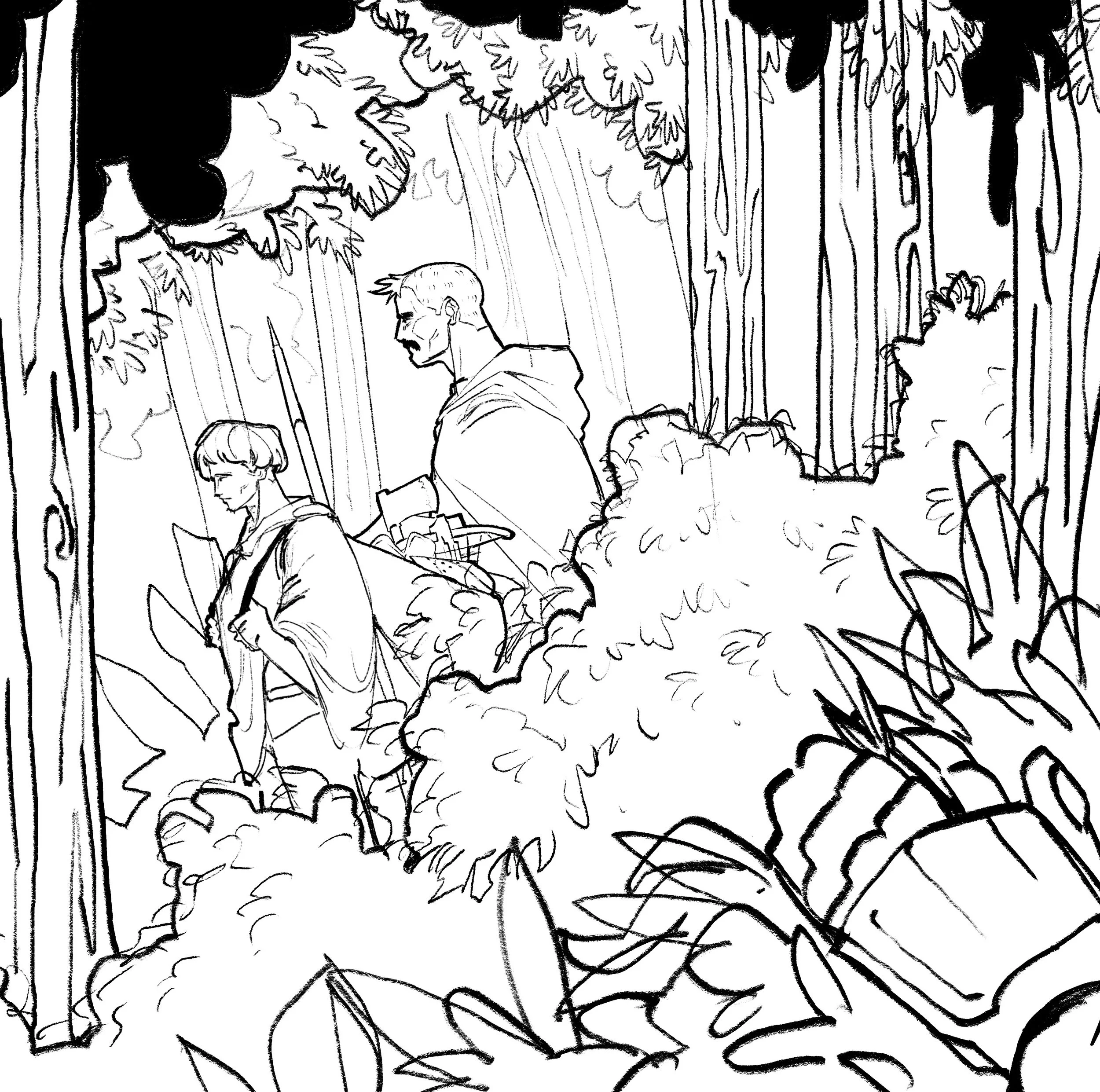
Print depicting a forest scene from The Knight and the Squire. Shows the two walking along a trail, surrounded by brush. Tone was used to create mood, along with vignetting.
A hand in the lower left corner betrays the title, creating a narrative within the piece that makes the setting feel uneasy due to the implication of the duo being tailed, an ambush likely impending.
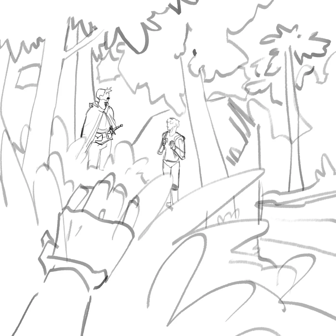
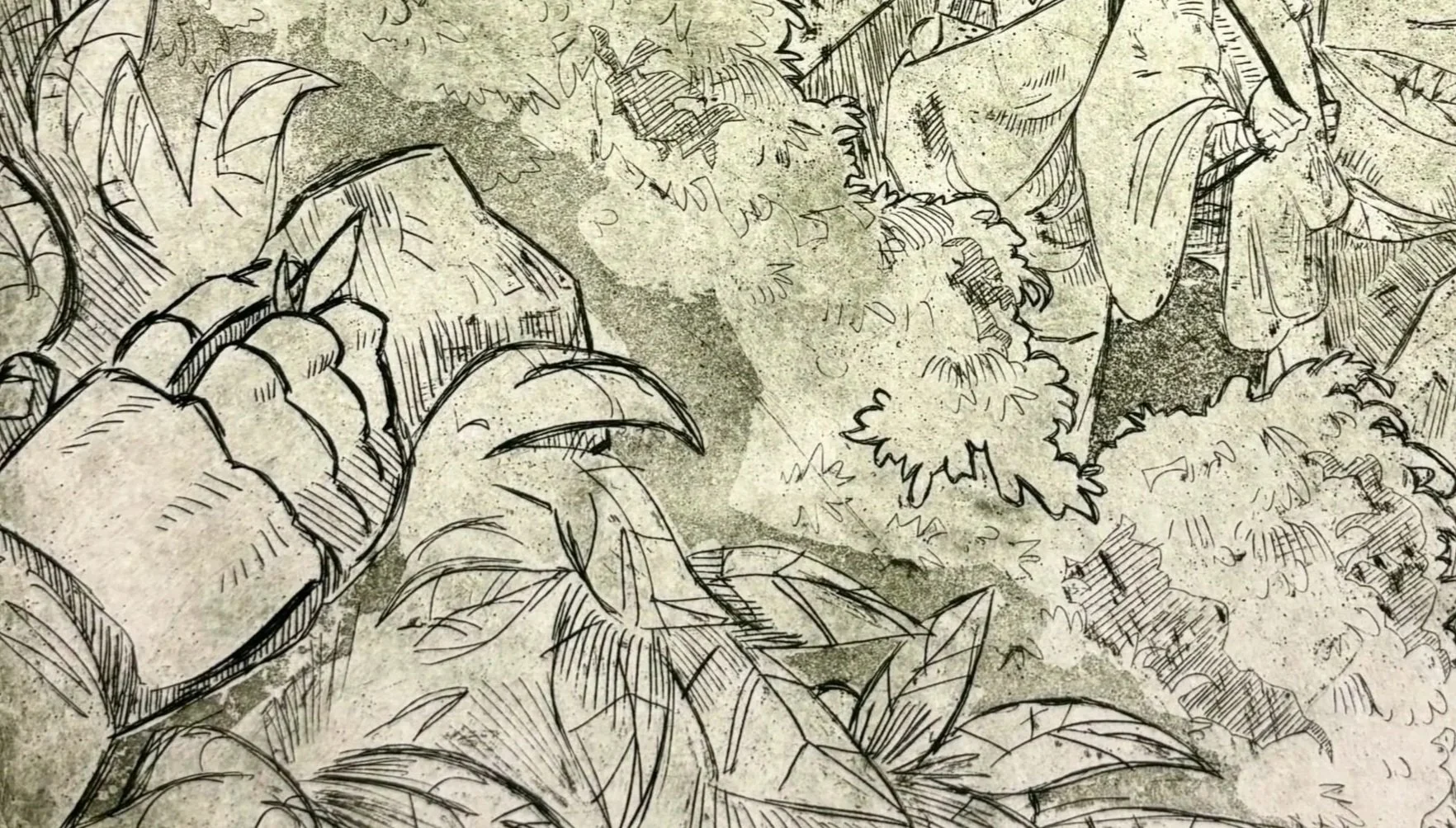
Initial texturing and foliage was scratched onto the plate prior to sketching, as to gain more familiarity with the surface and determine what kind of lines and hatching would complement the medium and the subjects the greatest.
Similarly, the proof print gave insight into the aquatinting process. Areas with more activity received less attention from aquatint, aside from toning, Areas with more negative space gave opportunities for the aquatint to give more form and depth to the environment.
Ideation surrounding the project was to explore background design in relation to character and unity between the two. Background had to visually complement and give focus to the two characters, yet had to be distinct enough as not to overwhelm the two.
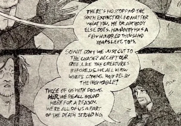
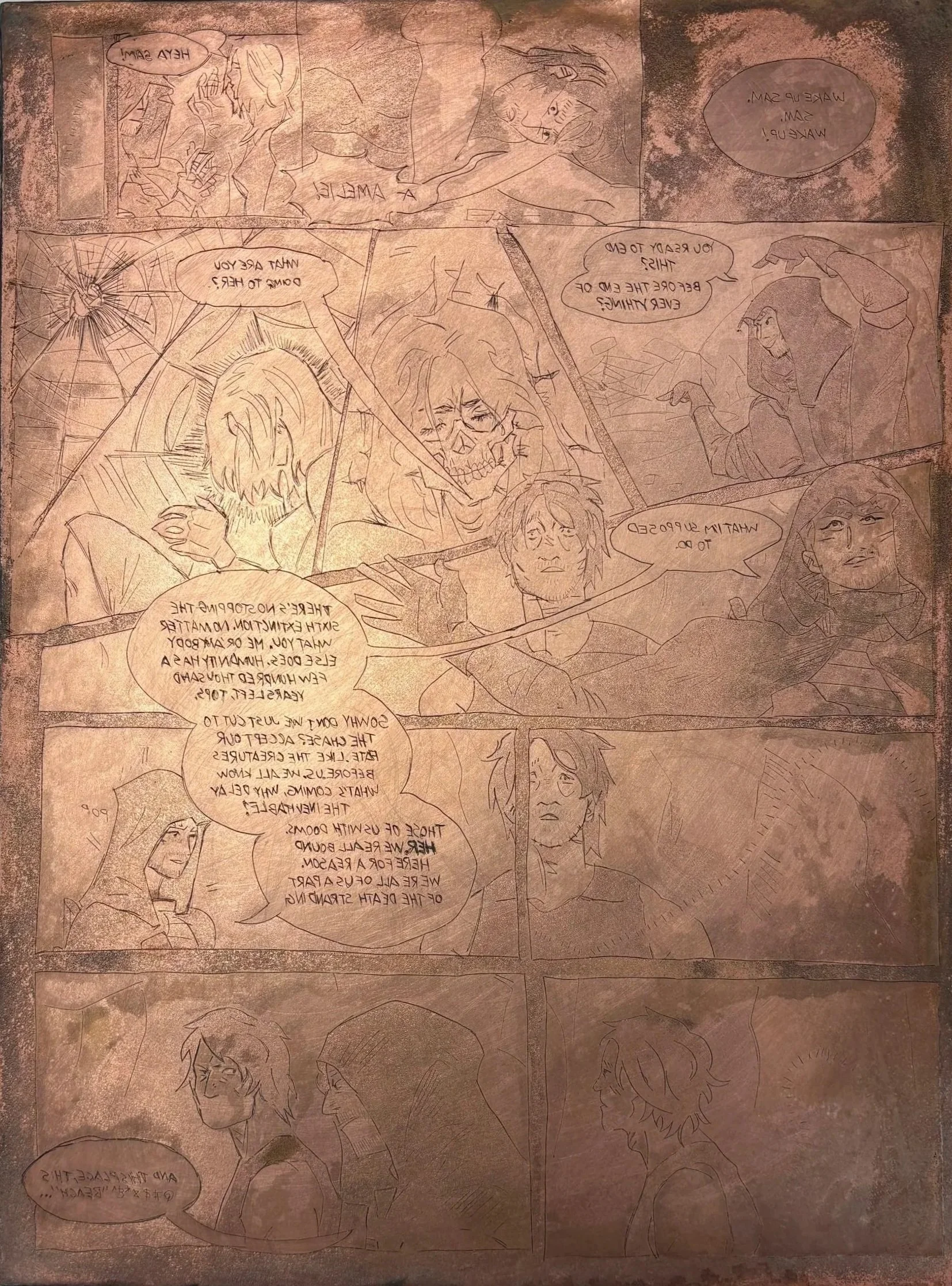
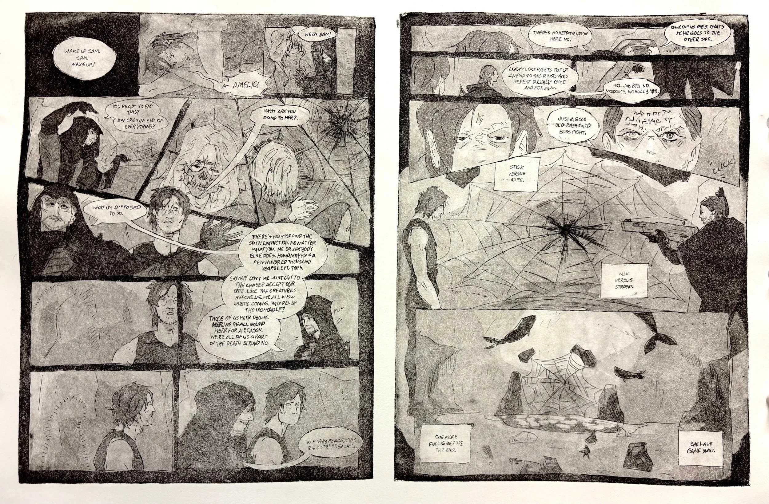
One Last “Game Over”
Copper, 19.5” x 13”, 2025
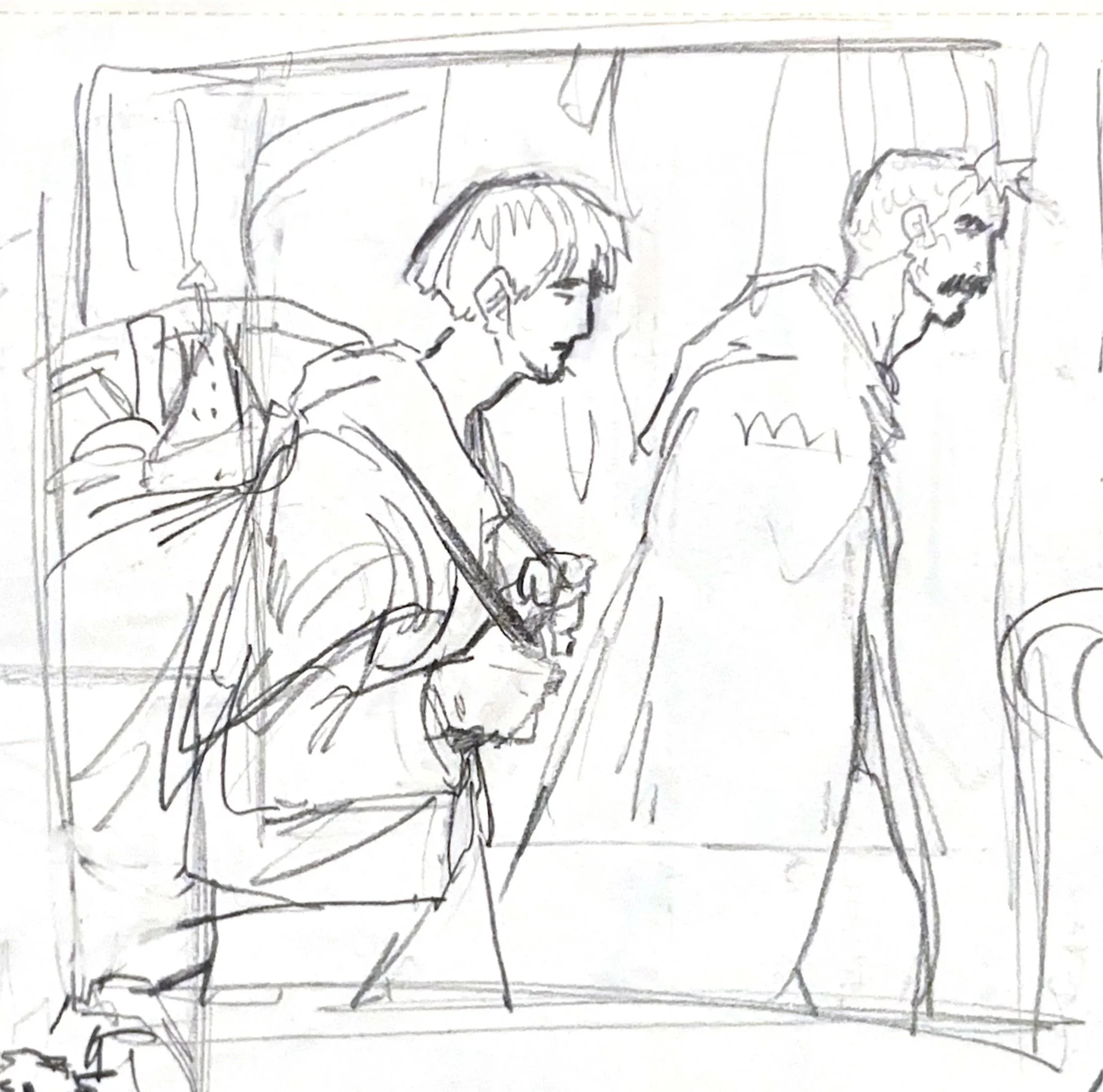
Comic recreating a scene from Hideo Kojima’s Death Stranding. A conversation between characters Sam and Higgs before the final boss fight of the game.
Much of the experimentation surrounding the comic regards paneling in regards to text economy. Most of the scene is a monologue from Higgs (hooded figure), teleporting as he’s speaking, which allows for interesting narrative pacing.
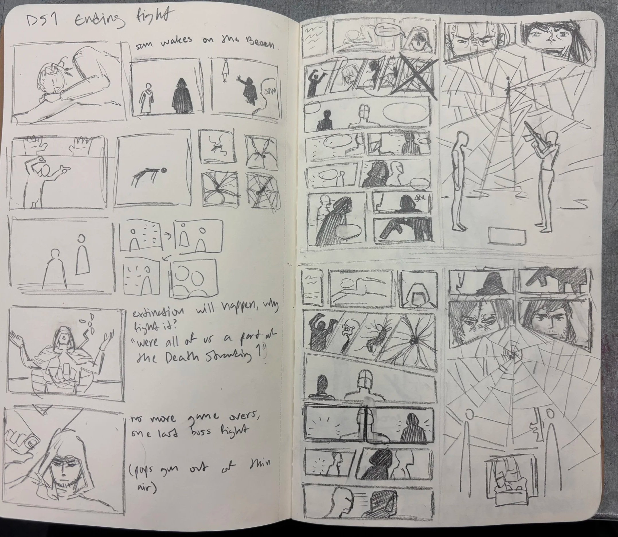
Comic Sans font was replicated, written into the plate backwards due to the plate flipping horizontally when printed.
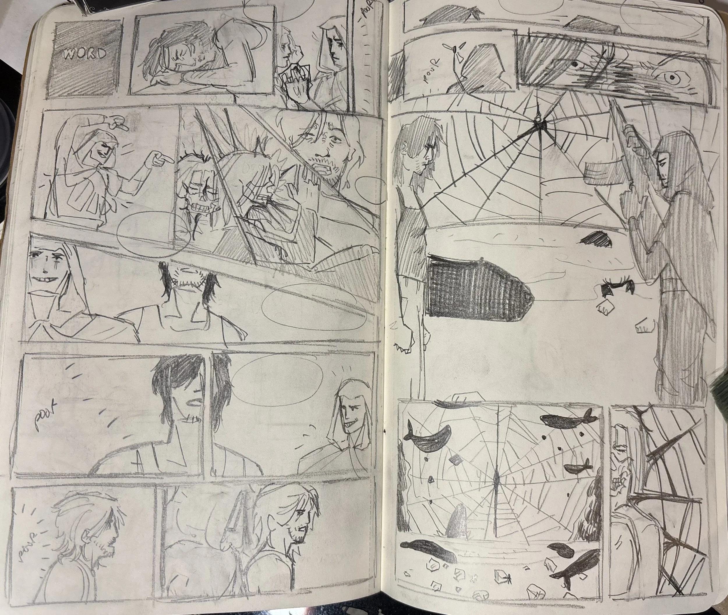
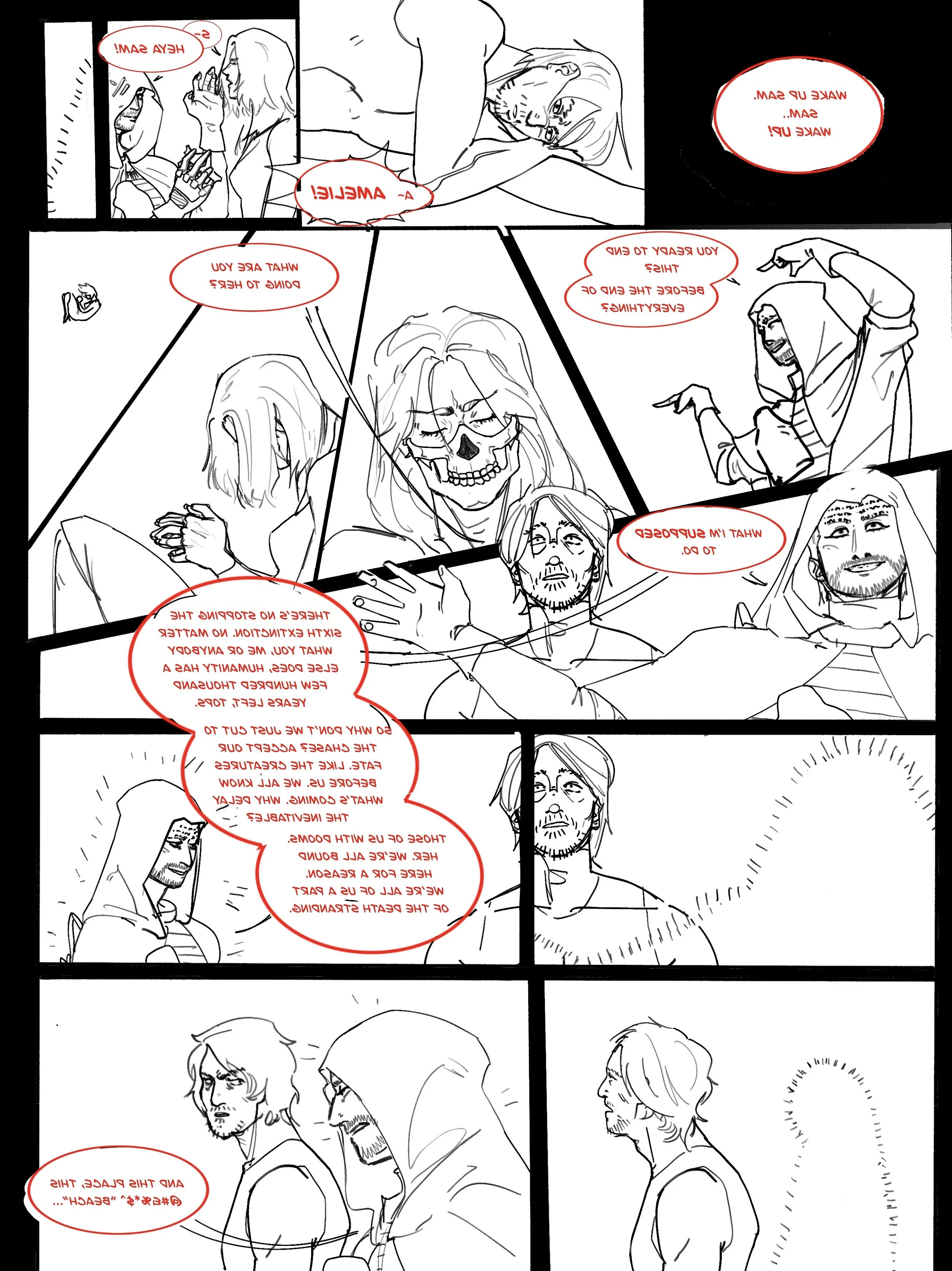
Most revisions during the sketching phase were revolved around panel reduction. First Page was crowded, and therefore less legible.
Tests were also done on how to effectively convey teleportation through panels, using both FX as well as the panels themselves. The visual space between the two characters was used to show where Higgs was teleporting in relation to Sam, the viewer’s center.